
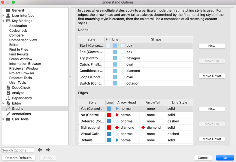
Cluster graph styles are customizable. The legend (accessible from the context menu) shows the current style rules.

The first column shows edge styles, the second node styles, and the optional 3rd column shows edge indicators on graphs that support them.
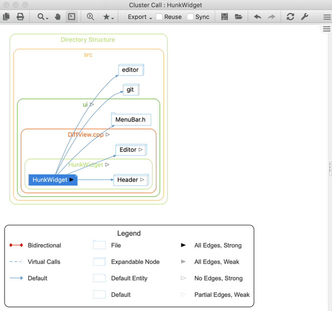
In the default style, any nodes that can be expanded into a cluster are shown as 3D boxes whether they are architectures (like editor and git), files (like MenuBar.h) or classes (like Editor and Header). The styles can be edited under graph options, accessible through the wrench icon in the toolbar or through tools->options->graphs menu (Windows) or Understand->preferences->graphs (Mac).
Custom Node Styles
For nodes, users have control over line color, fill color, and shape. The existing style rules can be edited, and new style rules added. New style rules only apply to graphs that use entities and architectures as nodes (specifically, they don’t apply to Control Flow Graphs or UML Sequence Diagrams).
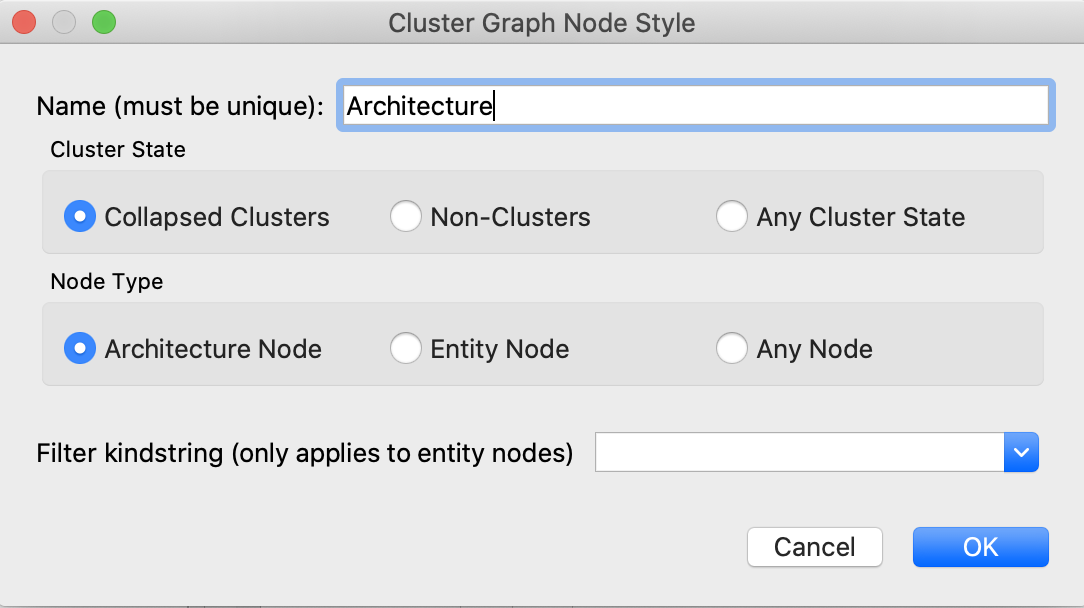
For demonstration, let’s add new styles for files and architectures to distinguish them from classes. Clicking the New button next to the Nodes style table brings up this dialog.

- The name identifies the style and will appear as the name in the legend. It doesn’t have to be related to the kind of node, but here we’ll name it “File” to keep things simple.
- The second option says this style will only apply to files with children (collapsed clusters) rather than non-clusters.
- Files are entities, not architectures, so the node type is set to Entity.
- The final option gives control over entity kinds. Files, classes, and functions are examples of entity kinds. In this case, the kind of entity we want the style to apply to is file entities, so we can just type “file”.
Clicking OK adds the style to the table, inheriting the default style settings.


Custom Edge Styles
Edge styles can be similarly configured. New edge styles apply to reference edges. In a call graph, the references are calls or called-by references. In a dependency graph, an edge may contain multiple reference kinds like an include or override reference. When multiple styles are defined and multiple reference kinds apply, the edges are shown as composites of the applicable colors.
For demonstration, here is an internal dependency graph for “DirectoryStructure/src/cred” in the GitAhead sample project. Right clicking on an edge shows the references that contribute to an edge.
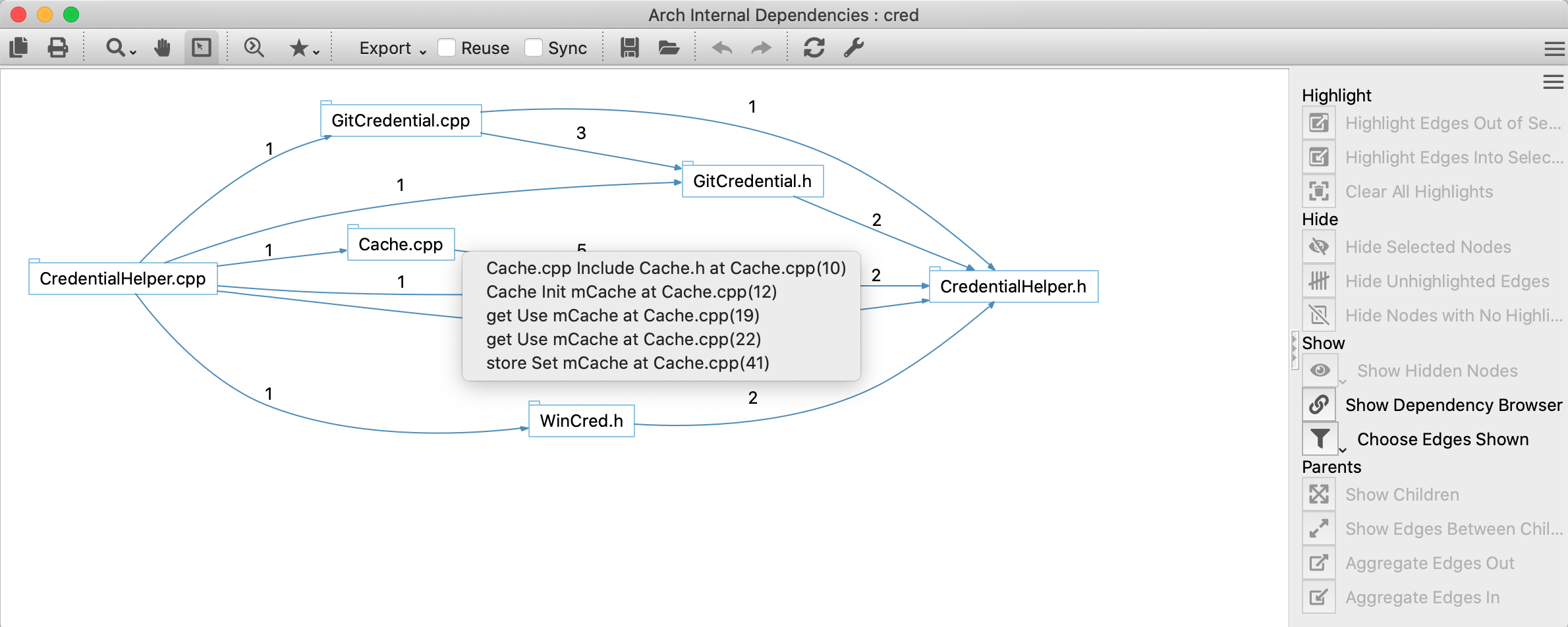


Now all colors that apply are included in the edge. Other aspects of the style such as the arrow head are determined by the first matching style.
